Read the story about how our 25th anniversary led to the corporate identity redesign.
It has been 25 years since DAVINCI introduced itself to the market. Throughout the years it has grown to a multinational FinTech company with offices in the Netherlands (Amsterdam), Belgium (Antwerp) and Slovakia (Bratislava and Žilina). We are widely associated with financial organizations and with values such as innovative, passionate and result driven. As you may have noticed, recently we have injected our company with brand new air. The rebranding is a part of the 25th anniversary, as a vision into the future.
It all started out with the idea to present DAVINCI in a unified style to our clients and to the public. Our company has a long and positive reputation, built on experience and expertise, something that needs to be reflected in DAVINCI’s culture, products and services. A unified identity inspires trust with both employees and clients. The importance of consistency throughout the visual communication cannot be faulted: “A good brand should not only allow people to remember who you are, but communicate your entire essence, history and values all at once.”
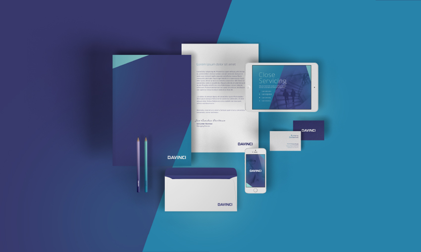
In short, the identity embodies all devices of the brand, such as the logo, letterhead, business card, website, etc. How the identity is applied to printed pieces and other media applications is conducted by a strict set of guidelines.
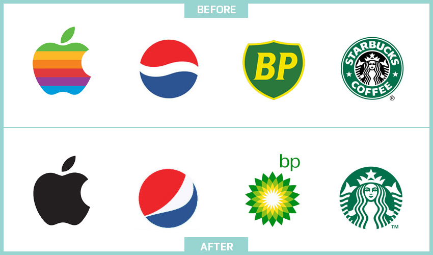
We can all name several iconic brands, that stand out from the “crowd”. Just to name a few: Coca-Cola, Starbucks, Macintosh and McDonald’s. I am sure that all of you had either colours of the brand or their logo popping into your minds. Why is that? Simply, because the human mind creates mental images of every experience. From the first interaction with the brand, our feelings about an organization’s service or product are subconsciously reinforced – often lasting a life-time. Which is why it is crucial to maintain visual continuity and recognition.
Rebranding is nothing new in the business world. As time goes by and new trends emerge, along with new consumer expectation, it is often an obvious choice for many companies, organizations to reinvent, rebrand themselves (see a few examples below).
Creating a strong identity requires one of the best in the graphic design. There was a unanimous decision about whom we wished to work with and fortunately for us, the young but talented Michal Slovak respectfully accepted our offer.
Logo: The devil is in the detail
Our journey begun with “fixing up” our existing logo, which was originally created using the Boom Box font-type. Although it was a strong logo, it lacked certain technicalities, which make a logo perfect.
While the changes may appear to be insignificant, they are actually extremely important – it’s the little details that make the design stand out. The letters have been aligned to form a straight line. Thus the letter “A” and “V” had to be adjusted slightly. Although the letter “C” wore a resemblance of the letter “D”, it appeared longer. Therefore it has been shortened. The smallest change is the increase of the inner arc, without it the typeface loses its character – mainly visible at smaller resolutions.
Probably the most significant update is the kerning. The spacing of the characters within the logo have been individually adjusted, thus creating a more compact and well composed logotype. Compared to the original version that was just a publicly available typeface, now we created something unique.
![]()
Discovery: A unique story told through unique design
We did a full analysis and noted everything we thought was useful: terminology, target audience, company history. We also discussed and reviewed all feedback from our board members and colleagues. We found contrast between the conservative financial industry we operate in and the innovative solutions we create. So we brainstormed around to find the best way to describe this contrast. We identified a “Slope” which represents Davinci as that invisible bridge. In that moment we realized, that we have our direction.
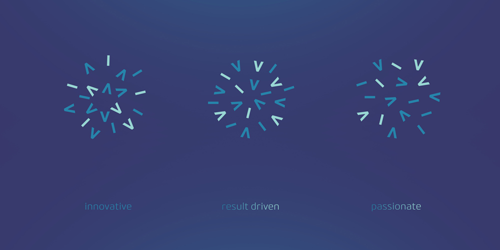
Elements: Energy in a new era
Davinci logo is our flag, consisting of strong characters of our identity. As part of the visual communication, we have come up with the idea of using the letters V and I of our logo. Thus portraying a more playful and modern side of Davinci, creating a unique story. To better identify Davinci as a brand, Michal used these letters as versatile shapes. These letters are our symbol (used in a certain angle they resemble a mark used in codeing ( </> ), recognizable across the web, as a tribute to the things we have made and we love. We are excited to see, where we can take it…
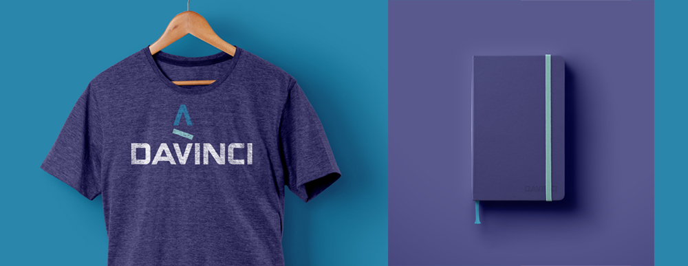
Colors: A breath of fresh air
Color is just one of many tools that can identify our brand, but extremely important. We’ve simplified our color palette to 1 corporate color (purple), 3 secondary colors (blue, turquoise and levander) and 2 additional colors (orange and yellow). A universal connection that people make with purple color is royalty, nobility, and prestige.
Typography: Traditional but strong
The journey took several months, during which we have encountered mainly ups, and only a few downs. From the very beginning we fell in love with the new colours, but the hunt for the corporate font proved to be perhaps more demanding than we initially anticipated.
We are a consultancy company specializing in software development, therefore we wanted something traditional, unique and strong. Something, that would complement the fintech industry with a fresh and elegant typeface. We went through dozens of typefaces before we chose BitnerTM (by The Northern Block Ltd.). To ensure maximum compatibility between browsers and operating systems, we picked Verdana as our secondary typeface.
Design, Learn and Iterate
During the last year, we found out what is the iterative design process. We created several design options until we found the right combination of elements, colors, typography and scalability across all devices and applications. We think we found the right one. It is clean, simple, yet highly functional just like Davinci… Nearly 25 years after its founding, Davinci is going stronger, than ever. Let’s see where it takes us in the future…
Graphic Designer
Attila k nám prišiel zo zeme pixelov a vektorov, kde hrával s jednorožcami paintball. Dokáže výborne vyhláskovať písmená v slove CMYK a RGB, a v celých vetách rozpráva jazykom developerov. Robí to síce zábavným prízvukom, ale ani to ho neodradilo od skúmania digitálnych krajín. V prípade, že aktuálne neskicuje, nekreslí a nedizajnuje, nájdete ho hrať basketbal s kamošmi.
Do you see yourself working with us? Check out our vacancies. Is your ideal vacancy not in the list? Please send an open application. We are interested in new talents, both young and experienced.
Join us