AngularJS is a JavaScript web application framework. It encapsulates the MVC (Model View Controller) and MVVM (Model View View Model) architecture models. One of its features that I like most is the two way binding.
Introduction
AngularJS is a JavaScript web application framework. It encapsulates the MVC (Model View Controller) and MVVM (Model View View Model) architecture models. One of its features that I like most is the two way binding. Nowadays, there are 2 versions of this framework:
AngularJS makes in many ways your work easier, but does not give you ready to use components for front end development that you might need like tables, buttons, input components etc. You can either write your own, which is time consuming, or you can find something available.
I’ve chosen the second option. I found several component frameworks available like Ionic, Angular UI Bootstrap (based on twitter bootstrap), Angular Material. Each of these provided quite solid and useful components with easy usage, but I wanted to try something not that well explored and brand new. Some time before, I worked on several projects that were using PrimeFaces (JSF – Java Server Faces based) component library. I like on this framework, that it has a lot of components ready to use, it is easy and comprehensive to use having enough flexibility to adjust the existing components or change the look and feel of your application.
Notice: As from the initial version of this article there was a final release of Angular 2 done with several changes (including NgModule configuration) and also new versions of PrimeNG released (with support for webpack configuration for example), I decided to update this article to keep it in sync with these changes. Major code changes were done with @NgModule and webpack configuration.
PrimeNG
PrimeTek, the company that created PrimeFaces and PrimeUI (pure HTML, JavaScript, JQuery component library), recently started to work on its own Angular component framework called PrimeNG. It is built on AngularJS 2.0 and written in TypeScript. In terms of usage, it is very similar to PrimeFaces. Basically, some of the components you find in PrimeFaces and PrimeUI can be found also in PrimeNG and they can be used in a very similar way. It also uses (as PrimeFaces) PrimeUI as its core dependency with similar CSS base etc.
It is a very young component library, the development started on January 2016. The development speed is pretty quick and many of the most useful components from PrimeFaces and PrimeUI are already available in PrimeNG. The 1.0 Final version is said to be delivered on 23rd of November.
PrimeNG at the current state of development provides a lot of ready to use components like DataTables, TreeTables, Dialogs, Menus, Charts, Drag&Drop functionality, Inputs (switches, dropdowns, spinners toggles …) and many more. If you want to check them out in action, just visit this link http://www.primefaces.org/primeng/ .
Nevertheless, PrimeNG supports JQuery Theme Rolles, so there are many free themes available to customize the look and feel of your application.
Showcase setup
It is not very difficult to set up PrimeNG application, however there are some known issues about making it work on Windows machines. I created an adjusted showcase for this article on Bitbucket https://bitbucket.org/davinci-ondemand/primeng-davinci/overview. I worked on linux machine, but majority of commands can be executed on Windows, Linux and Mac.
Prerequisities to run PrimeNG showcase:
If you have all the prerequisities you have to only execute following steps to make the application run:
It can happen, depending on your version of npm, that not all peers in npm install will be installed. In this case I’ve installed all missing peers manually.
Application structure
After cloning the repo you can see the project structure. In the main directory there is mainly configuration stuff. In package.json you can see that we are using before mentioned Angular2, but you also can see that we are using the latest version (for now) of PrimeNG and PrimeUI. In tsconfig there is the TypeScript configuration for compiler and in typings.json, other dependencies.
Current PrimeNG version is configurable using webpack. Because of this fact there is a new webpack.config.js file in the root folder which contains following:
var webpack = require("webpack");

module.exports = {
    entry: {
        'polyfills': './app/polyfills.js',
        'vendor': './app/vendor.js',
        'app': './app/main.js'
    },
    output: {
        path: __dirname,
        filename: "./prod/[name].js"
    },
    plugins: [
        new webpack.optimize.CommonsChunkPlugin({
            name: ['app', 'vendor', 'polyfills']
        })
    ]
};
In the config mentioned above, there are 3 plugins for which entries are specified. Polyfills (APIs expected to be provided by browser natively), vendor (for vendor specific imports)
and app (for application specific ones). We also specify where production build code will be located.
Let’s check now the main application, which is located in app folder.
In domain folder, there is a simple domain object defined.
export interface Person {
   cardId;
   name;
   surname;
   country;
}
You can see that it is only a simple Person interface that has 4 attributes. I’ll use this object for data representations.
In resources folder, there is icon folder with icon images and persons.json file where sample data for person is defined.
Core data provider for our sample will be the personservice defined in service folder.
import {Injectable} from 'angular2/core';
import {Http, Response} from 'angular2/http';
import {Person} from '../domain/person';
import 'rxjs/Rx';

@Injectable()
export class PersonService {

	constructor(private http: Http) {}

     getPersons() {
     	return this.http.get('app/resources/persons.json')
					.toPromise()
					.then(res => <Person[]> res.json().data)
					.then(data => { return data; });
	}
}
The @Injectable is an Angular2 decorator for implementing the dependency injection. GetPersons method takes the persons.json resource file and maps its data to Person array. So basically it provides all persons defined in file. I’m going to use this service in component, when showcasing the PrimeNG datatable.
Datatable showcase
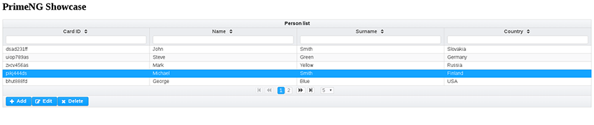
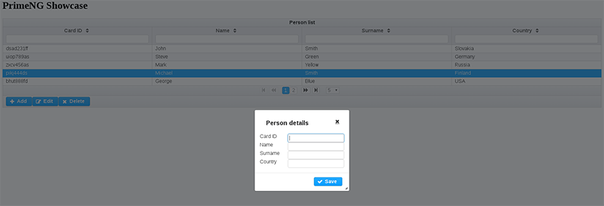
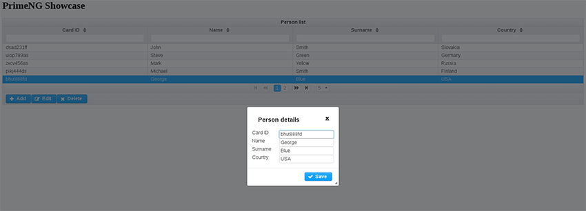
I’ve prepared a showcase to demonstrate part of the functionality of PrimeNG. On this image you can see the expected result.
Whole table with filters
Adding new person
Editing person
The core of the showcase is defined in app.component.html (component template) and app.component.ts (component).
The showcase lists all persons from persons.json file into a table, which allows user to sort and filter the data. It has also a paginator. Besides that, it supports also to create, update and delete operations person data.
For this purpose I’ve chosen the DataTable component, which is provided by PrimeNG. Also all elements that will be used for this showcase like buttons, dialog, input fields are provided by PrimeNG. Step by step, I’m going to explain, how this sample was created.
Module
The newest Angular version uses NgModules to manage components in a better way. There is only one module in the application now, the “AppModule” module. As you can see it has provider declared for PersonService. Also it is not necessary to declare directives on @Component itself, but it is done now in imports part of NgModule. Furthermore they are bundled in modules, so we don’t have to enumerate all component directives necessary for DataTable etc. Bootstrap and declarations part defines our AppComponent where the main logic of this application happens.
@NgModule({
    imports: [BrowserModule, FormsModule, HttpModule, InputTextModule, DataTableModule, ButtonModule, DialogModule],
    declarations: [AppComponent],
    bootstrap: [AppComponent],
    providers: [PersonService]
})
export class AppModule {
}
Component
First of all, the AppComponent class is the place where the front end logic for our persons view will be. For this purpose, I’m defining this class to be a component as follows:
@Component({
    selector: 'my-app',
    templateUrl: 'app/app.component.html'
})
export class AppComponent implements OnInit {
As you can see, our selector for this component is called my-app (this is used in index.html). In the following part of the component, the variables that I’ll use are defined.
persons: Person[];
cols: any[];
displayablePerson: Person = new DisplayablePerson();
displayDialog: boolean;
selectedPerson: Person;
newPerson: boolean;

constructor(private personService: PersonService) { }
In persons array, I’m storing all the persons retrieved from personService. DisplayablePerson is a class that implements the Person interface, and it is binded to the forms for creating and editing the person. Columns that will be displayed in table are stored in cols array. displayDialog variable is used to control if the dialog is displayed or not.
As I mentioned before, this showcase will allow user to edit and delete person. It is necessary for this purpose to be able to select person in table. I use selectedPerson variable to store the selected person. newPerson variable serves as a check when save button is pressed. If it is true, then new person is created, otherwise the selected person is updated.
Angular provides us interface OnInit with method ngOnInit, which is called when the component is created. At this moment, I want to instantiate persons data and cols (columns). The implementation looks as follows:
ngOnInit() {
	this.personService.getPersons().then(persons => this.persons = persons);
	this.cols = [
		{ field: 'cardId', header: 'Card ID' },
		{ field: 'name',   header: 'Name' },
		{ field: 'surname', header: 'Surname' },
		{ field: 'country', header: 'Country' }
	];
 }
On following lines, I’m going to describe the methods, that are called from html, which then I’ll describe even further from html view.
To be able to delete and edit person, I want to update selected person everytime when table row is selected. For this purpose, I’m using onRowSelect method:
onRowSelect(event) {
    this.newPerson = false;
    this.displayablePerson = this.clonePerson(event.data);
}
This method reacts to event produced by DataTable as we are going to see in a moment. I’m declaring newPerson to false in this case and I’m cloning selected data shipped by event to displayable person for possible edit action triggered afterwards.
There are two buttons under the table that can open a new dialog: Add and Edit. Click action on Add button triggers the showDialogToAdd method which is defined like this:
showDialogToAdd() {
    this.newPerson = true;
    this.displayablePerson = new DisplayablePerson();
    this.displayDialog = true;
}
In case of add dialog, we want to create new person. For this purpose, I initialize displayablePerson with empty DisplayablePerson instance. I also want the dialog to be displayed. It is sufficient to only set the displayDialog variable to true and the dialog is immediately displayed, thanks to Angular two-way binding.
Displayable person variable is bind to the form displayed on the view, so all the data will be automatically set to the displayablePerson on background.
Save button action of the dialog is connected to save method:
save() {
    if (this.newPerson)
	   this.persons.push(this.displayablePerson);
    else
        this.persons[this.findSelectedPersonIndex()] = this.displayablePerson;
        this.displayablePerson = null;
        this.displayDialog = false;
}
As you can see, the save method has different behavior depending on newPerson variable. After performing necessary actions the displayDialog variable is set to false and so the dialog is closed.
When editing, I want the selected person to be preserved, so the form can be filled with these values, to allow user to edit them. After clicking on edit button the showDialogToEdit method is called:
showDialogToEdit() {
	this.displayDialog = true;
}
Also save button action for edit is the same as for add new person, but in this case we can see that showDialogToEdit method does not set newPerson variable to true, so an existing person in persons array is going to be replaced.
Last action of this table is delete. It is binded to delete method. Delete method removes person from the array, hides dialog and nullifies selectedPerson and displayablePerson.
 showDialogToAdd() {
    this.newPerson = true;
    this.displayablePerson = new DisplayablePerson();
    this.displayDialog = true;
}
Let’s move now to view
View
The html file consists of two parts: DataTable and dialog. First, I’m going to start with dataTable. DataTable is component provided by PrimeNG. Withing the dataTable component, you can define header, columns of table, footer etc. The dataTable element looks as follows:
<p-dataTable [(value)]="persons" selectionMode="single" [(selection)]="selectedPerson" (onRowSelect)="onRowSelect($event)" rows="5" [paginator]="true" [pageLinks]="3" [rowsPerPageOptions]="[5,10,20]" [globalFilter]="gb" [responsive]="true">The [(value)] defines the data variable from component, in our case persons array. This table should allow only one row selection (selection mode – single). Selected row will be stored to [(selection)]=selectedPerson. When you want to catch row selection event of the table you can do it using onRowSelect directive. Of course, you can set other properties to the table like rows to be displayed, you can add paginator or even global filter (filters all columns). It is really very simple.
Columns definition is even easier.
<p-column field="surname" header="Surname" [filter]="true" filterMatchMode="contains" [sortable]="true"></p-column>This way you define one column of the table. Field directive represents the field name in the domain object, in our case it is Person. Header is only text label of the column. As I wrote in introduction, I want the columns to be filterable and sortable.
To be able to modify person data, I have defined three buttons: Add, Edit and Delete. Buttons are located in footer of the table. I’m going to demonstrate the usage using the Edit button, which looks as follows.
<button type="button" pButton icon="fa-pencil-square-o" style="float:left" (click)="showDialogToEdit()" [disabled]="selectedPerson == null" label="Edit"></button>This button is also PrimeNG modified button (you can recognize it by the pButton flag). As you can see the click action of this button is showDialogToEdit, we’ve talked about recently. I want this button to be disabled when there is no selected person (selectedPerson == null condition).
Dialog definition is also pretty simple.
<p-dialog header="Person details" [(visible)]="displayDialog" [responsive]="true" showEffect="fade" [modal]="true"> Dialog’s visibility is controlled using [(visible)] directive. In my case, I use for this purpose the displayDialog boolean variable. Inside the dialog, I have defined a form that is used to modify Person.
I use for this purpose, inputs, concretely its PrimeNG modifications pInputText.
<div class="ui-grid-col-8"><input pInputText id="surname" [(ngModel)]="displayablePerson.surname" /></div> You can see, that the ngModel is attached to displayablePerson.surname variable (this means that value of this input is set to displayablePersons attribute surname and viceversa).
This short part of code allows us to define filteratble and sortable table with Create, Update and Delete operations on specified data.
Adjustment possibilities
UI component library can offer a lot of components that are ready to use, but often, even in this case can happen that you might want some other new small feature to add to existing component or extend it to your own shape. PrimeNG is open source, so you can download the code of existing components and adjust them, or you can simply extend existing components and adjust the functionality that you need.
Let’s demonstrate how to make a small adjustment to select button component shown on the image below.

This component is provided by PrimeNG. It allows you to define multiple buttons between which you can switch. By default, you cannot unselect when once selected. This means, that if you have 3 buttons and you select one of them, you cannot unselect it by clicking it again. Now, I’m going to implement the unselect functionality.
As mentioned before, I want to adjust select button, so after cloning the source code of PrimeNG, I’m going to components/selectbutton folder. There is only one file, selectbutton.ts. Below this paragraph, you can see the code snippet we are going to work with:
@Component({
    selector: 'p-selectButton',
    template: `
        <div [ngClass]="'ui-selectbutton ui-buttonset ui-widget ui-corner-all ui-buttonset-' + options.length" (mouseleave)="hoveredItem=null" [attr.style]="style" [class]="styleClass">
            <div *ngFor="let option of options;" class="ui-button ui-widget ui-state-default ui-button-text-only"
                [ngClass]="{'ui-state-hover': hoveredItem == option,'ui-state-active':isSelected(option)}"
                (mouseenter)="hoveredItem=option" (click)="onItemClick($event,option)">
                <span class="ui-button-text ui-c">{{option.label}}</span>
            </div>
        </div>
    `,
    providers: [SELECTBUTTON_VALUE_ACCESSOR]
})
export class SelectButton implements ControlValueAccessor {
    @Input() options: SelectItem[];
    @Input() tabindex: number;
    @Input() multiple: boolean;
    @Input() style: string;
    @Input() styleClass: string;
    @Input() unselectable: boolean;
    @Output() onChange: EventEmitter<any> = new EventEmitter();
You can see, that it contains standard component template. One of the disadvantages of PrimeNG when working with large component templates is, that they are defined directly in @Component decorator, which combines both the html and Typescript together. I think they should be defined in own html file to separate the html logic from the backing JavaScript (TypeScript) logic. This way, majority of IDEs is able to provide you autocomplete and code highlighting for both: typescript and html.
The classes used are taken from PrimeUI and are shipped with PrimeNG, so you don’t have to care about styling. You can see, that this component has defined @Input and @Output parameters. Input parameters are simple variables, the output parameter is an event emitter, which is used to emit event when component state changes.
The following code shows the logic where item selection change is handled:
if(this.multiple) {
	let itemIndex = this.findItemIndex(option);
     if(itemIndex != -1)
     	this.value.splice(itemIndex, 1);
       else
          this.value.push(option.value);
}else {
      this.value = option.value;
}
I want to apply the unselect option to single select mode. In this code it is the else branch. You can see that now the selected option value is set as selected value. But the behavior that I want is, that when I click second time on the button, it will be unselected.
For this purpose and for purpose of not changing the existing functionality, I’m going to define new @Input parameter, which is going to tell if the unselect option is allowed or not. If not, I want to have default behavior.
@Input() unselectable: boolean;Default value of unselectable input parameter is false. Now I’m going to change the above mentioned code to this:
onItemClick(event, option: SelectItem) {
        if(this.multiple) {
            let itemIndex = this.findItemIndex(option);
            if(itemIndex != -1)
                this.value.splice(itemIndex, 1);
            else
                this.value.push(option.value);
        }
        else {
            if (this.unselectable && this.value == option.value) {
                this.value = null;
            } else {
                this.value = option.value;
            }
        }
}
You can see that when the unselection is allowed, and the newly selected option is the same as the before selected one (means I click twice on the button), the new option is set to null – it is unselected.
Conclusion
In my opinion, PrimeNG has a very good perspective to be component rich and easy to use Angular2 component library. The PrimeUI and PrimeFaces frameworks are nowadays feature rich and very handy APIs, which I used on several projects that I worked on. PrimeNG is in early stage of development, and I think, that in very short time it can reach the quality and robustness of these two. As a conclusion, I decided to sum all the pros and cons that I’ve experienced. The cons are generally caused by the fact that PrimeNG is very young framework.
| PROS | CONS |
| based on Angular2 | not enough tutorials and stack overflow questions yet |
| already plenty of useful components available | can be problematic to make it working with different versions of NodeJS or operating systems (linux/windows) |
| easily extensible and adjustable | In some parts of existing code, I’d divide the code into more smaller parts to be more comprehensive |
Java Developer
Jakub pred prácou v Davinci popri škole pracoval na viacerých projektoch s využitím JavaEE a Spring/GWT. Vo voľnom čase sa venuje skúmaniu nových technológii, cyklistike, turistike a hre na gitare. V minulosti sa tiež venoval akademickej debate.
Do you see yourself working with us? Check out our vacancies. Is your ideal vacancy not in the list? Please send an open application. We are interested in new talents, both young and experienced.
Join us